
02Scholarship nonprofit, Bay Area · Rebrand, 25th year · Brand, print, web, film
Eight logos. One brand.
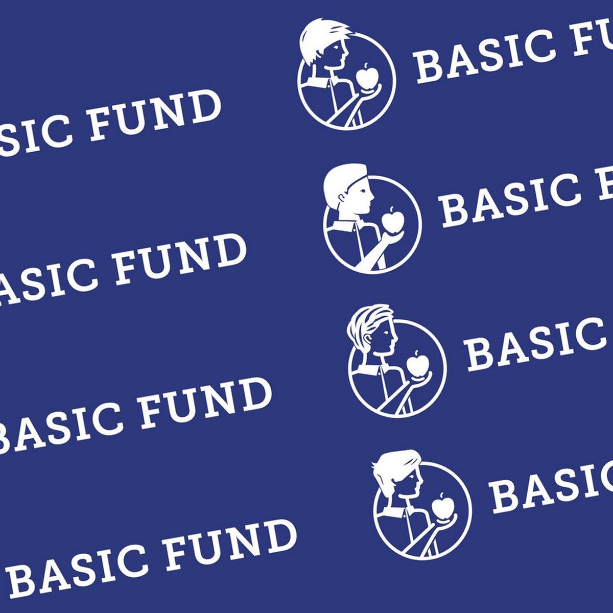
A privately funded nonprofit paying partial tuition for low-income families across the Bay Area needed an identity as diverse as the families it serves. One child illustration couldn’t do it, so we drew eight, and built the brand so no two encounters with it are quite the same.
- 8Logos, one brand system
- 1 in 8Odds of the same logo twice, in print or on the site
- 25Years of caring, marked with a new anniversary lockup
- BoardBuilt with leadership and the board, not around them
Where it started
The Basic Fund had been opening private school doors for Bay Area families since 1998, and its brand looked like it. The board wanted an identity that spoke plainly to three audiences at once: the families it serves, the donors who fund it, and the professionals who sit on its board. And it had to honor who those families actually are.
What we did
We worked with the CEO and the board directly, not around them. The first round produced a single child illustration, and the review made the problem obvious: one child can’t stand for thousands. So the mark became a set. Eight children, one system, and a rule that the brand never shows the same face twice in a row. Then the stationery, the donor mailers, the site, and a film to tell the story.
- 01AlignmentCEO and board in the room, three audiences named.
- 02One, then eightThe first review turned a logo into a system.
- 03The systemStationery, mailers, website, a 25-year mark.
- 04The storyA two-and-a-half-minute explainer, voiced by Jim Nantz.
Sometimes one logo isn’t enough.
Eight children, drawn to share a family resemblance and nothing else. Same circle, same apple, same weight of line, so any one of them reads as The Basic Fund on its own and all eight read as one brand together. The wordmark holds still while the mark changes.
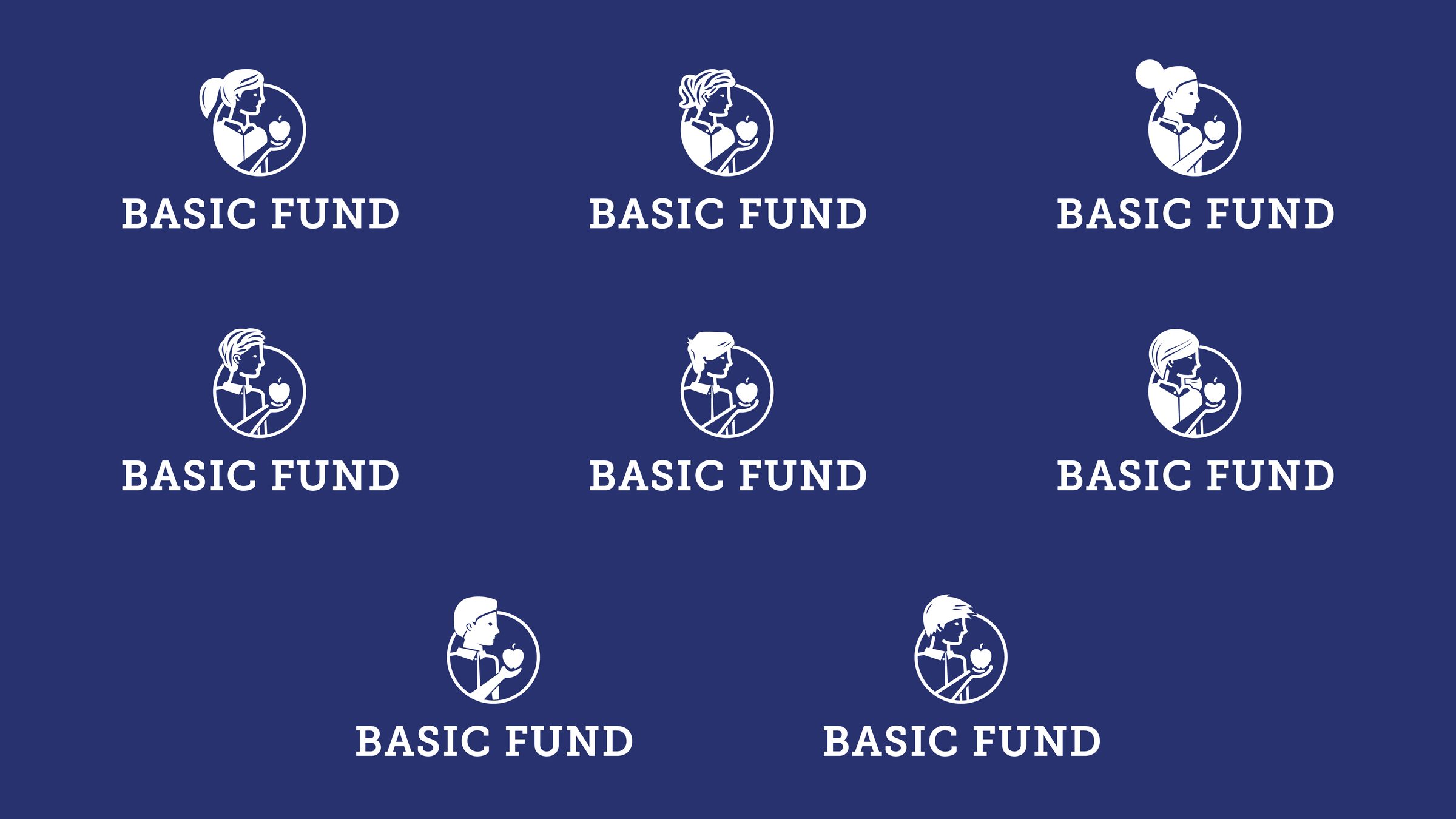
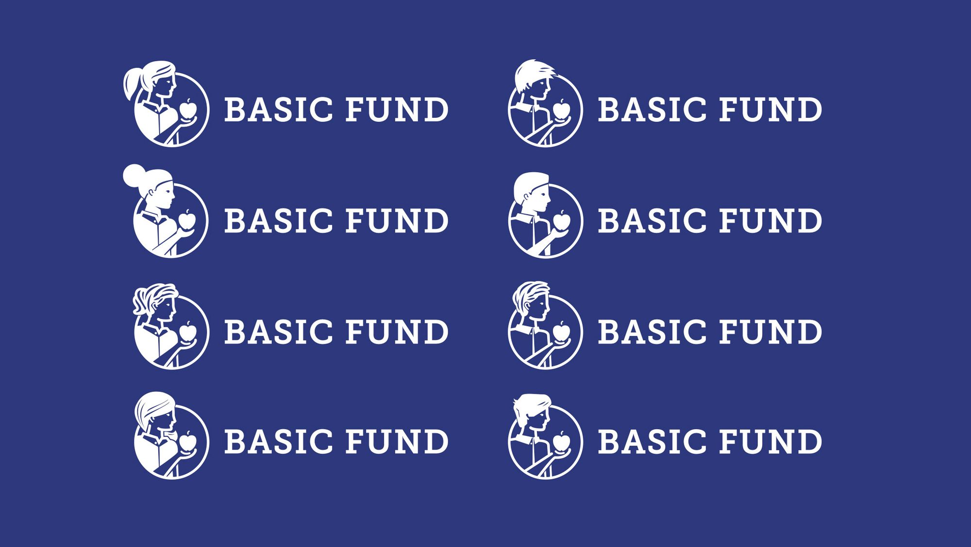
Eight lockups
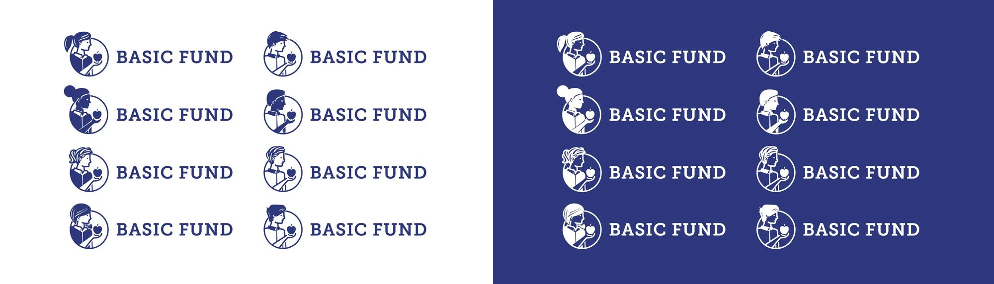
One color, both ways

I am a critic of creative firms and their approaches. I’ve seen quite a few and they often reflect great creativity but not so great connection to the business and real world. DarkSquare is an exception. The brand they created for us was very well done.
The delight of the unexpected.
Eight logos posed a practical problem with a charming answer. The stationery was printed one child per set, then shuffled, so every letter that leaves the office carries a randomly chosen face. Business cards, envelopes, the donor mailer and the 25th-anniversary lockup all run on the same logic.
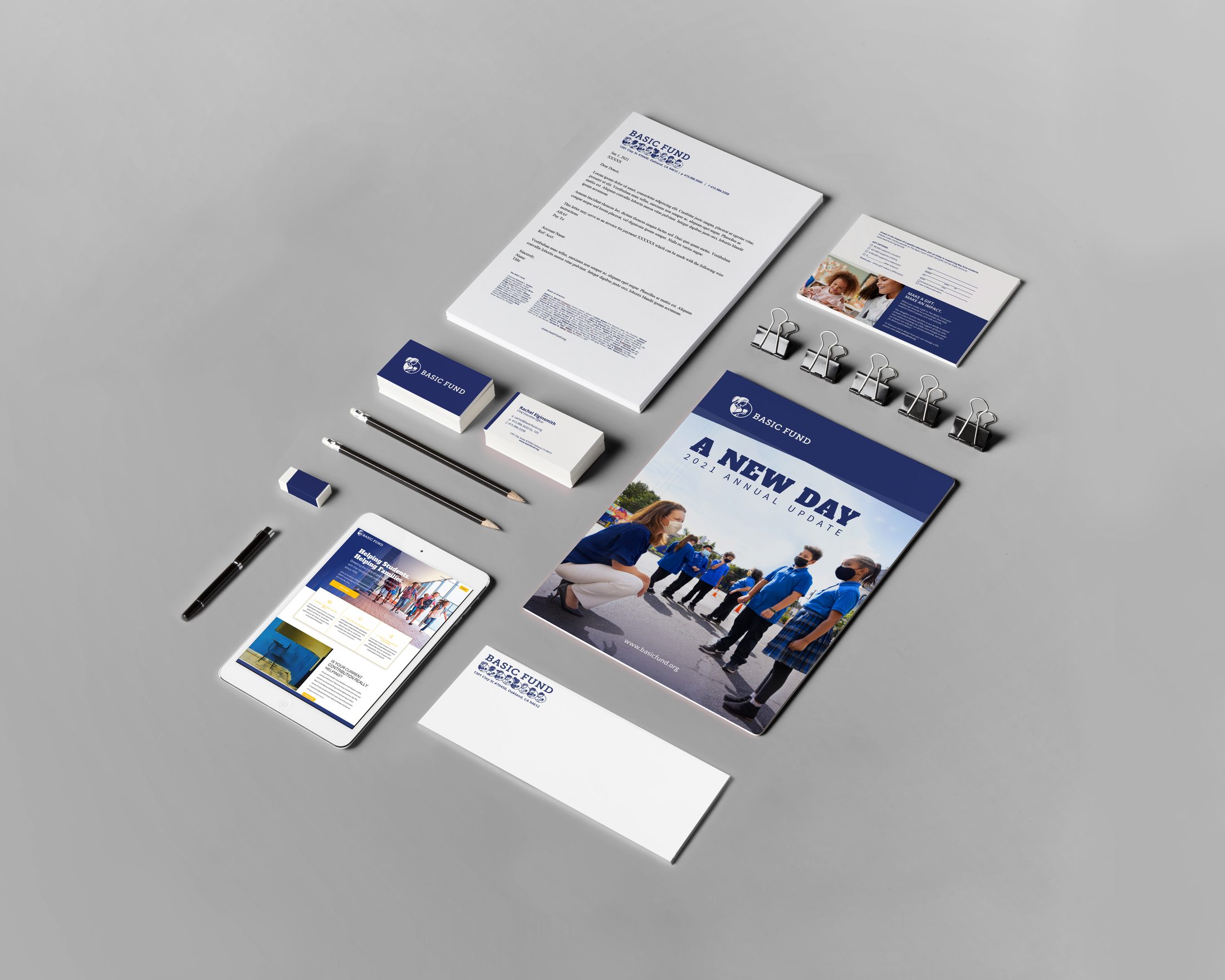
Stationery, shuffled
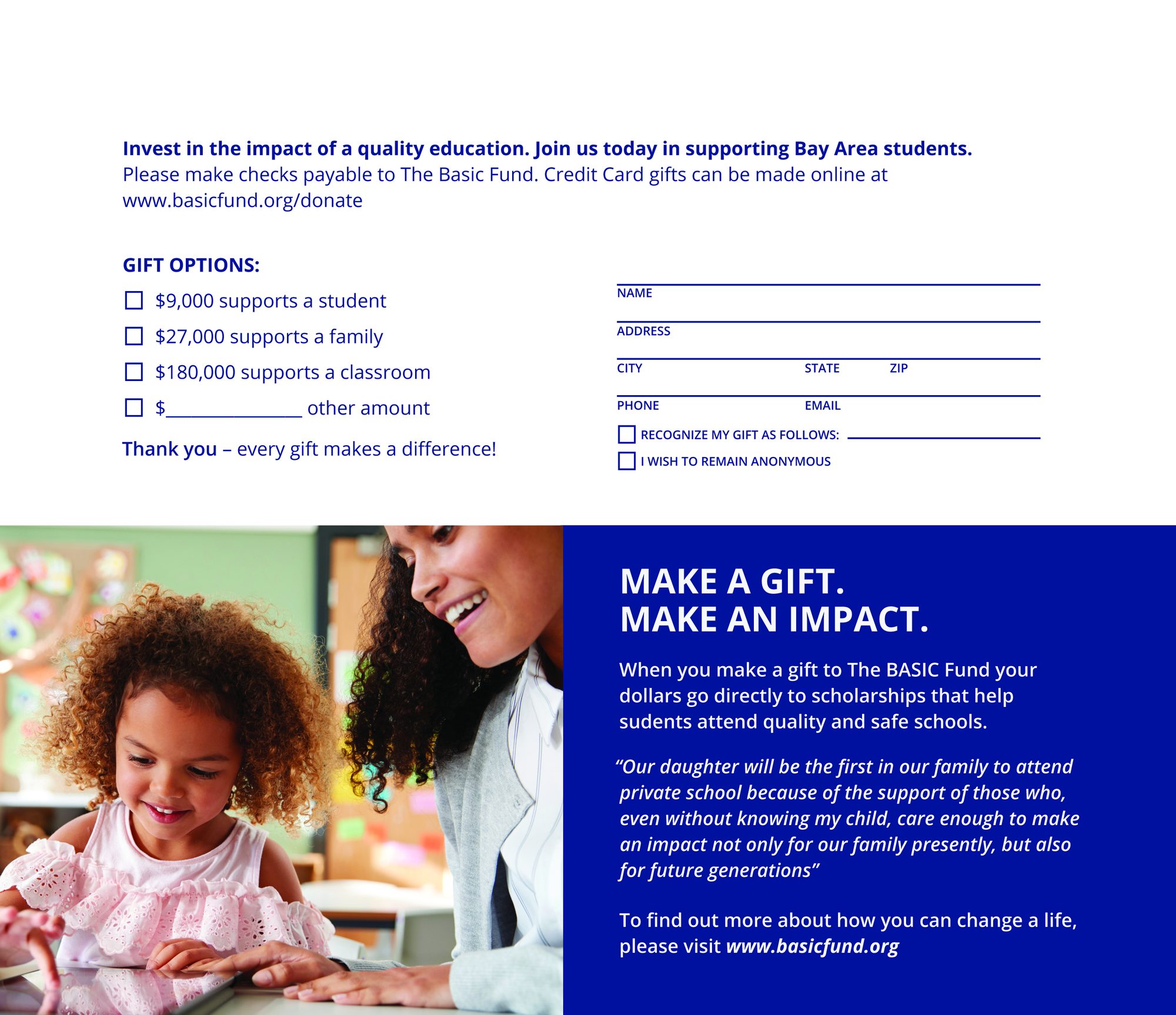
Donor mailer
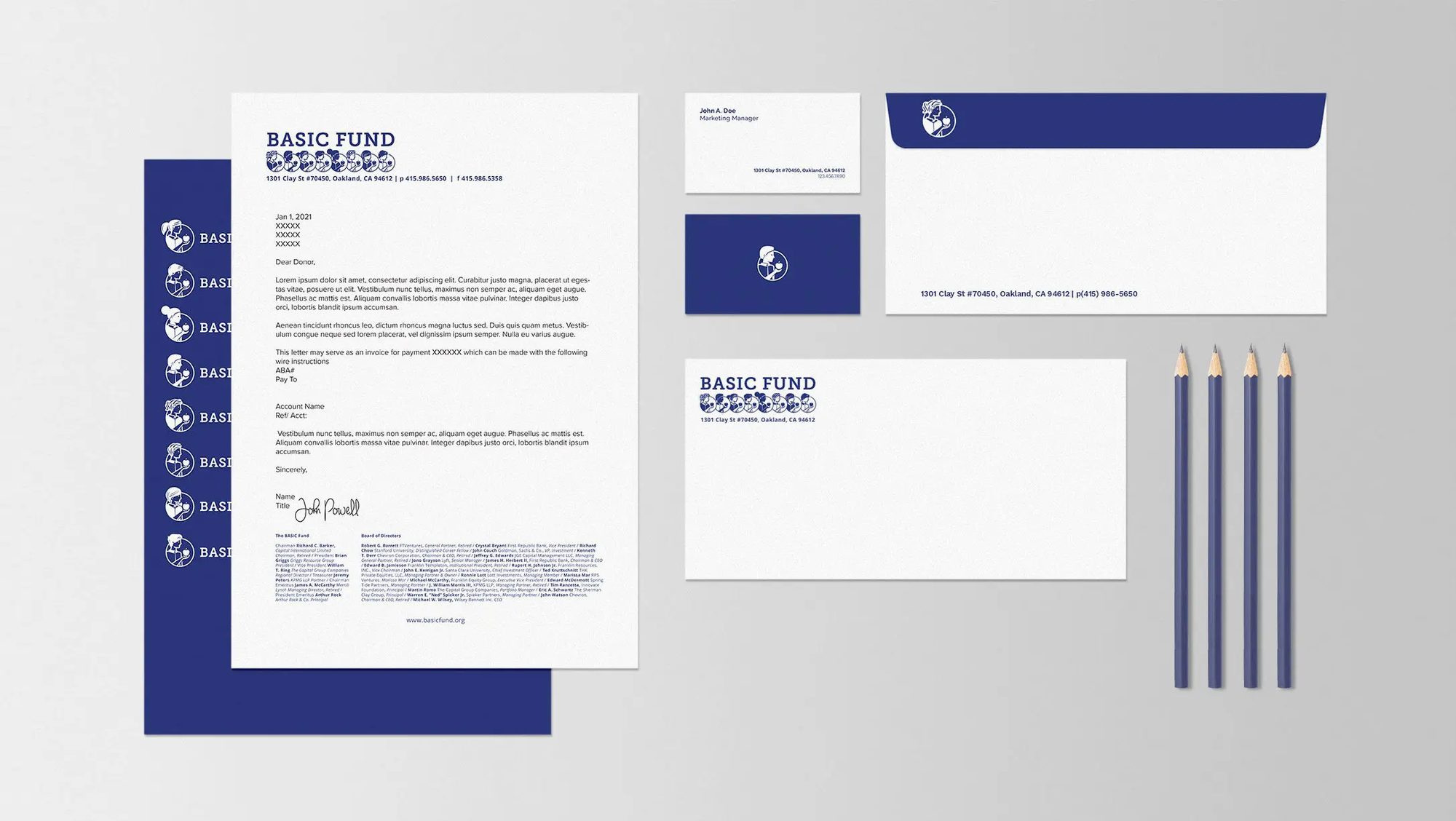
One child per set
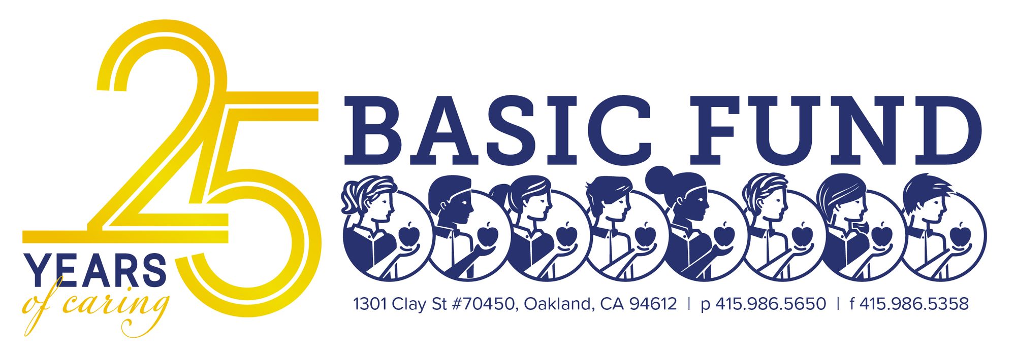
25 years of caring
A different logo every page load.
The site picks one of the eight at random on every impression. Refresh and it changes. Beyond the trick, it is a nonprofit site that does its job: who the Fund is for, how to apply, how to give, without a donor having to hunt.
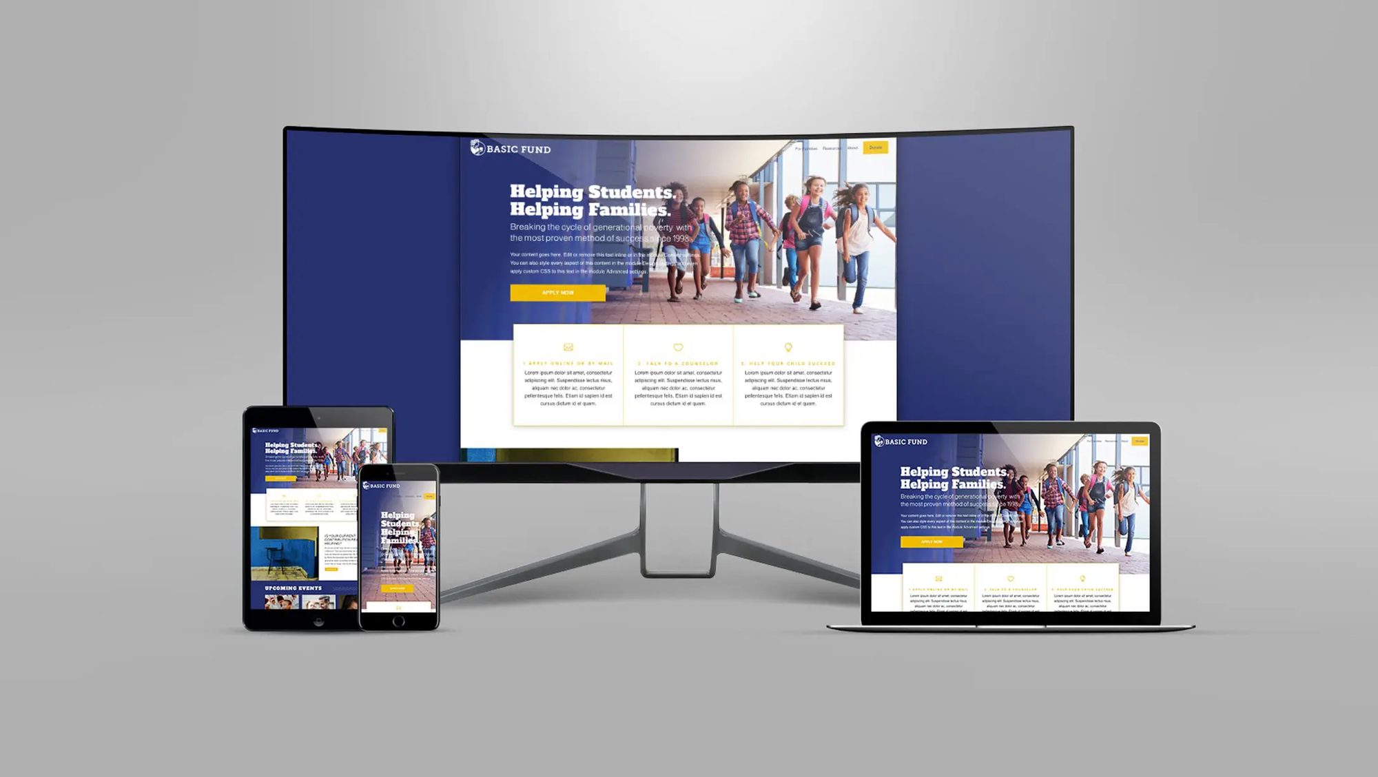
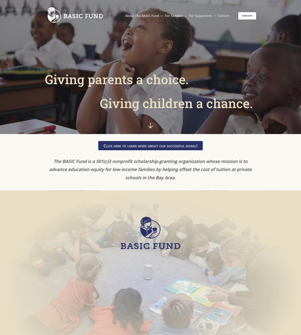
HomepageHover to scroll
Animating a cause, with Jim Nantz.
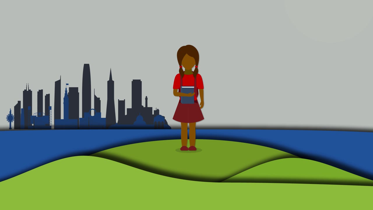
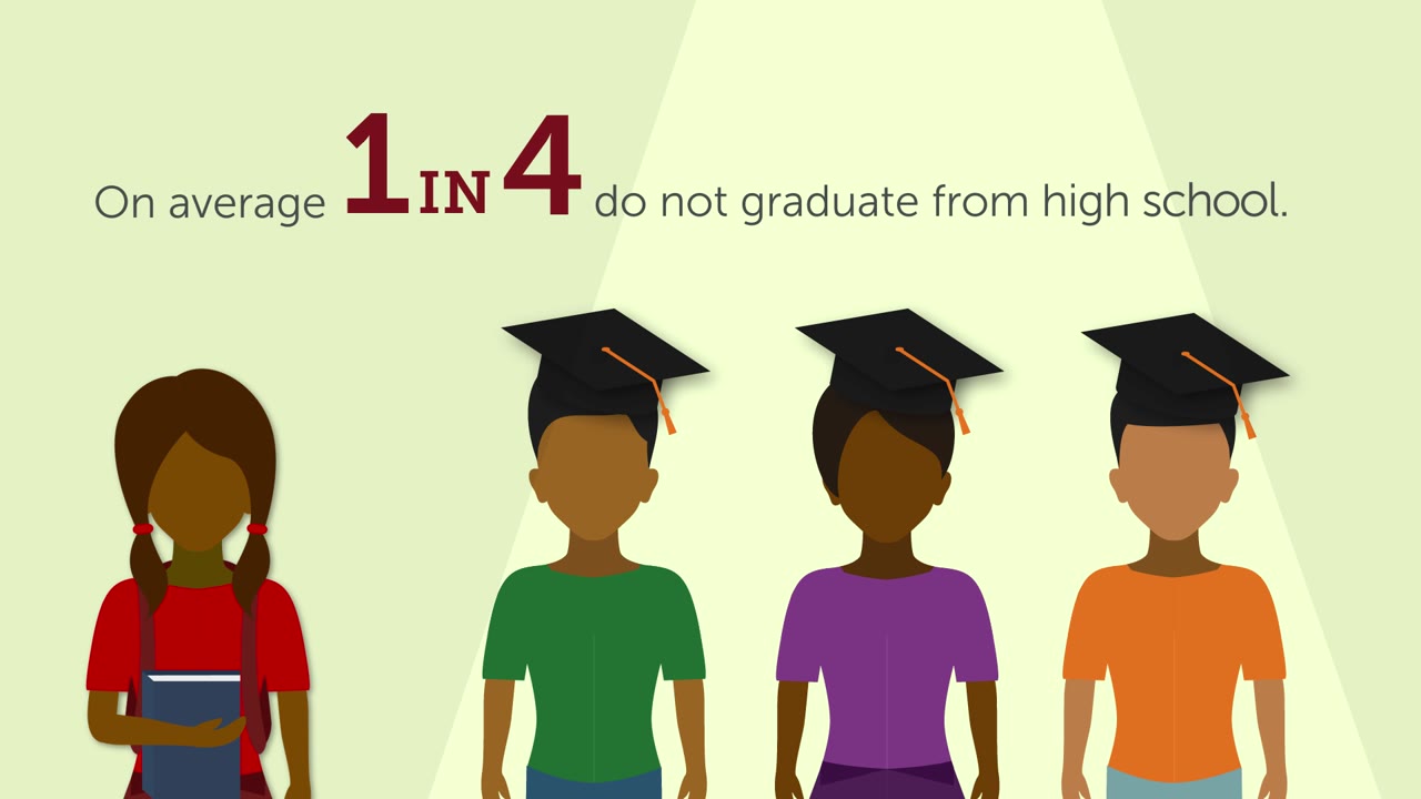
A two-and-a-half-minute explainer to bring in new donors, written and storyboarded with the CEO and the board, illustrated and animated by our team, and voiced by the sports broadcaster Jim Nantz. It follows one typical Basic Fund student from a Bay Area sidewalk to a graduation, with the numbers behind the story on screen.


DarkSquare helped us create a brand that spoke clearly our values to the communities we serve, the donors who partner with us, our board of professionals, and our own internal team. It was important that our new brand honored the diversity of the families we work with and the area we operate in. Their sensitivity and imaginative approach helped us do that in a powerful and sincere way we never would have thought of.
The rest of the work.




Start with a conversation.
One call and we'll tell you if this is a fit. If it isn't, we'll say so and point you somewhere better.