Basic Fund
Rebranding the Future of a Generation
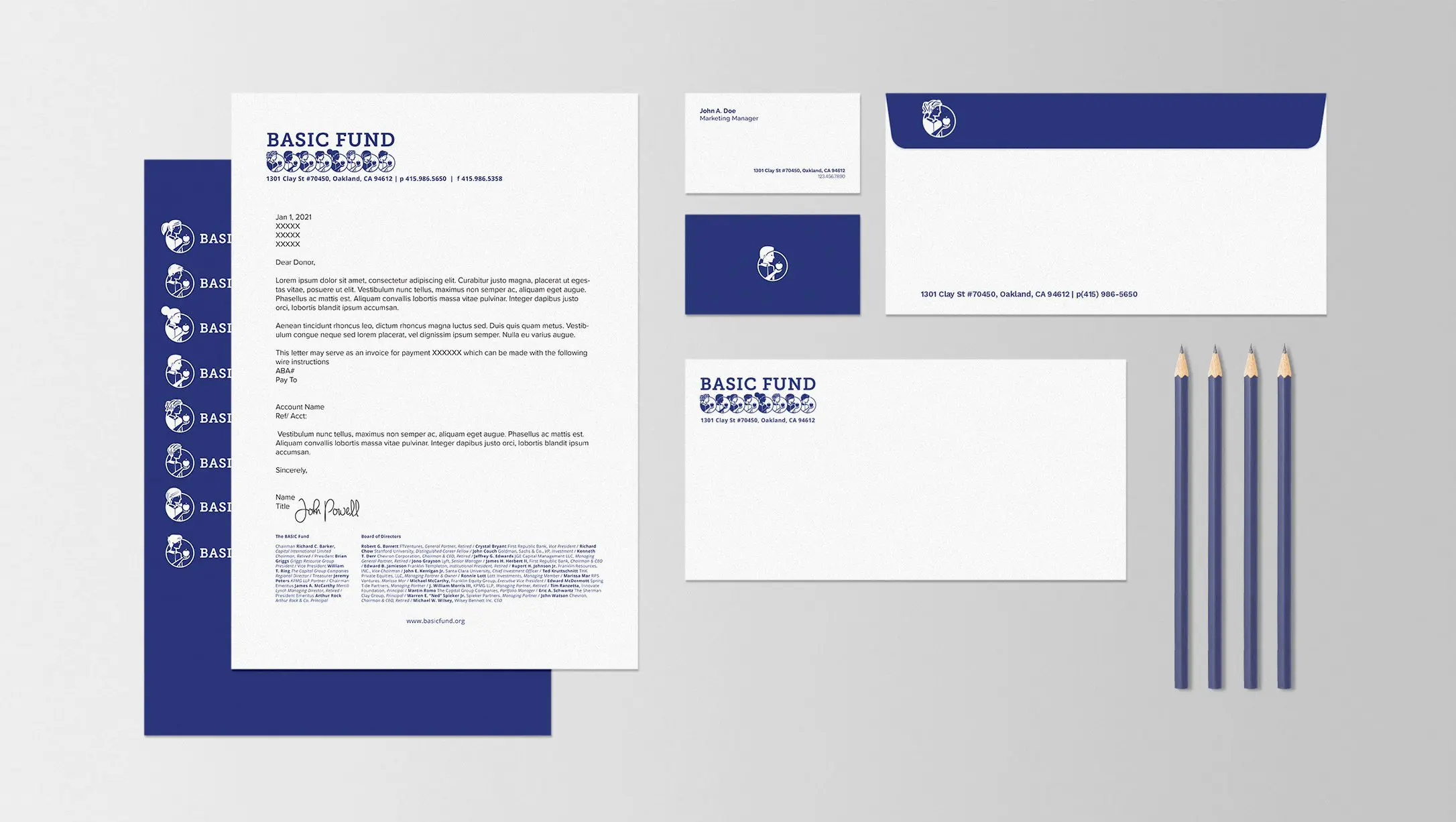
The BASIC Fund is a privately-funded nonprofit providing partial-tuition scholarships to low-income families across the Bay Area. DarkSquare worked closely with their leadership and board to develop a brand as diverse and creative as the communities they serve.

Sometimes One Logo Isn’t Enough
During the review of our initial design work it became clear that one child illustration would not be representative of the many diverse families that The BASIC Fund serves. We developed 8 different children illustrations with different characteristics to represent a broader range of ethnicities and gender.

I am a critic of creative firms and their approaches. I’ve seen quite a few and they often reflect great creativity but not so great connection to the business and real world. DarkSquare is an exception. The brand they created for us was very well done.
The Delight of the Unexpected
Having 8 different logos presented a few pragmatic challenges that offered surprising and charming solutions. A set of stationary was printed for each child illustration, then shuffled. Each correspondence would have a randomly selected logo offering a moment of discovery and realization for the recipient. This creates a memorable and sharable brand experience they won’t forget. The logo on the website is also programmed to randomly generate one of the 8 designs on each impression. The result is a different logo every time you revisit or refresh a page.


DarkSquare helped us create a brand that spoke clearly our values to the communities we serve, the donors who partner with us, our board of professionals, and our own internal team. It was important that our new brand honored the diversity of the families we work with and the area we operate in. Their sensitivity and imaginative approach helped us do that in a powerful and sincere way we never would have thought of.
More Projects
Join Our Mailing List
Art and Technology Meet At Design
We’re passionate about branding, technology, fine art, and design. Our team regularly curates articles that provide unique insights into these domains. When you subscribe, you’ll not only get access to these handpicked reads but also occasional updates on what’s happening at DarkSquare. Dive into meaningful content and see how we engage with these topics in our projects.